


Color as a Silent Communicator
When you walk into a room, the first thing your eyes latch onto is the paint, the lighting, the furniture, and the people’s clothing. Each of these elements carries a coded message, a wordless sentence that can be understood without a single spoken utterance. The colors we encounter daily perform a subtle dialogue with our senses, nudging us toward particular feelings or actions.
Imagine a hospital corridor painted in a soothing teal. The hue is chosen not for its aesthetic appeal alone, but because studies show that cooler tones can calm the nervous system and reduce perceived pain. Even a simple shift from bright yellow to a muted blue can alter how patients experience the space, guiding them toward a sense of safety and trust.
In advertising, a splash of red on a billboard is more than a visual eye‑catcher; it triggers adrenaline, urgency, and a call to action. A designer might pair that heat with a cool contrast, creating a visual tension that compels viewers to read the copy or click on a button. The palette, therefore, functions as a strategic element in the narrative a brand wishes to tell.
Beyond professional settings, everyday choices of color reflect personal identity. Choosing a wardrobe that aligns with your mood can act as an internal affirmation, while the background colors of your phone or computer interface can influence your productivity. Colors are the unspoken language we use to set intentions before we even open our mouths.
In group settings, the color of a team’s t-shirts, presentation slides, or shared workspace subtly signals cohesion, hierarchy, and openness. When a project manager opts for a charcoal gray executive briefcase, it projects gravitas. Conversely, a team that adopts a calming teal in its shared documentation may convey an environment of collaboration and mutual respect.
These examples illustrate that color is not a passive backdrop. It is an active participant in communication, often more influential than the words we write or speak. The right hue can guide emotions, reinforce values, and ultimately shape behavior. The next sections will unpack how these effects come into being and how they have evolved across cultures and time.
Color’s silent language operates through a complex interplay between visual perception, cultural conditioning, and psychological response. Understanding this dynamic can empower designers, marketers, educators, and anyone who relies on visual storytelling to make choices that resonate deeper than the surface level.
Whether you’re crafting a brand identity, designing a workspace, or selecting paint for a home, keeping the silent conversation of color in mind can help you communicate more precisely. The following sections explore the layers that give color its communicative power, from ancient symbolism to modern science.
Historical Roots of Color Language
Long before the advent of modern pigments, early human societies used natural dyes to signify status, belief, and affiliation. Cave paintings in Lascaux reveal deliberate pigment choices: ochres for ground, charcoal for outlines, and mineral blues for sky. These early palettes were more than artistic experiments; they were a language shared across generations.
The Egyptians are renowned for their mastery of color symbolism. Blue, derived from lapis lazuli, came to represent the heavens and divine protection. Gold, beyond its material value, became the visual embodiment of the sun god Ra’s eternal light. The careful placement of these hues on sarcophagi and temple walls communicated an afterlife that was both sacred and ordered.
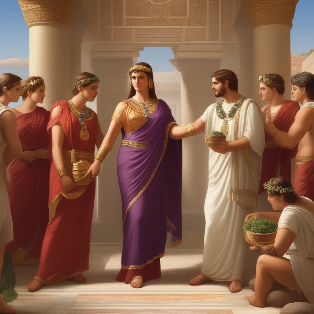
In the Roman Empire, red - sourced from cinnabar - connoted power, war, and sacrifice. The legion’s crimson armor and the Senate’s crimson banners reinforced a visual hierarchy that could be recognized instantly on the battlefield or in the marble corridors of Rome. Color, therefore, became a tool of authority, a visible cue that commanded respect.
The medieval church leveraged color to instruct the illiterate masses. Gold scrollwork indicated divinity, while a deep blue in the robes of the Virgin Mary symbolized her celestial role. In this era, the Church’s use of color functioned as a visual catechism, teaching complex theology through pigments that resonated with the populace’s collective imagination.
Across continents, indigenous cultures also used color as a storytelling medium. The Māori of New Zealand incorporate patterns of red and black in their war paint to denote bravery and resilience. The Native American Hopi tribe uses ochre and white to mark sacred objects, linking the earth’s elements to cosmological beliefs.
These historical precedents show that color has long been a universal language. It transcended spoken dialects, allowing societies to embed meaning into the very fabric of their surroundings. From divine protection in Egyptian murals to the authority of Roman soldiers, color has served as a bridge between intention and perception for millennia.
Understanding these roots offers insight into why certain colors carry the associations we experience today. The cultural memory embedded in pigments persists, subtly influencing our choices in modern design and communication.
As societies evolved, so did the symbolic weight of colors. Yet the foundational principle remains: hues act as communicators, encoding cultural narratives that pass from one generation to the next. The next sections will show how these ancient traditions intersect with contemporary science and psychology.
The Science of Color Perception
Color perception begins in the retina, where cone cells detect light wavelengths and send signals to the brain’s visual cortex. Three types of cones - S, M, and L - respond preferentially to short, medium, and long wavelengths, enabling the brain to differentiate between blue, green, and red hues. This physiological process is universal, yet interpretation is far from static.
Context shapes perception: a color that appears vibrant in daylight can look muted in artificial light. A warm amber lamp might feel inviting in a living room but could appear harsh in a kitchen if the surrounding decor is cool-toned. The brain constantly recalibrates hues based on surrounding stimuli, a phenomenon known as color constancy.
Cultural conditioning further refines this perception. In Western societies, blue often conveys trustworthiness, a link reinforced by corporate logos and political campaigns. In contrast, some African cultures associate blue with mourning. These cultural lenses filter the raw visual data, adding layers of meaning before a decision is made.
Personal experiences also leave an imprint. A child who associates bright orange with the summer holidays may feel nostalgia when exposed to that color again. These emotional ties can strengthen memory retention, as research shows that emotionally charged stimuli - often facilitated by color - are recalled more easily than neutral ones.
Neuroscientific studies reveal that colors can alter hormone levels. Exposure to green light has been linked to increased melatonin production, which can promote restful sleep. Conversely, a sudden burst of red light may elevate cortisol, preparing the body for a perceived threat. These hormonal shifts illustrate how color can influence physiological states.
In marketing, understanding these mechanisms helps brands craft palettes that resonate. A brand targeting young adults might use a bright, saturated palette to stimulate dopamine release, encouraging impulse buying. Conversely, a luxury brand might opt for muted neutrals to evoke calmness and sophistication, aligning with the target demographic’s emotional profile.
When designers choose colors for public spaces, they often rely on evidence-based guidelines. For instance, the International Organization for Standardization (ISO) recommends specific color combinations for signage to maximize readability and reduce visual fatigue. These guidelines translate complex perceptual research into practical application.
The convergence of physiology, psychology, and cultural studies shows that color is a multi‑layered communication channel. It is a language that can be decoded with both art and science, allowing designers to create environments that speak directly to the human body and mind.
By acknowledging the nuanced interplay of light, culture, and biology, professionals can harness color to produce more effective designs that resonate on a deeper level. The next section explores how everyday interactions tap into this silent language.
Color in Everyday Interaction
In the workplace, the color of a manager’s attire can influence how colleagues perceive authority. A charcoal gray suit projects confidence without overt aggression, whereas a vibrant yellow blazer might signal creativity and approachability. These cues operate subconsciously, guiding expectations before a single word is spoken.
Team collaboration is similarly affected by color. A group that uses teal in shared documents or a calm blue in their meeting room can foster a sense of unity and calm. When everyone adopts a consistent color scheme, the team’s identity becomes instantly recognizable, reinforcing cohesion.
In digital communication, color continues to play a pivotal role. A website that relies heavily on muted greys may convey professionalism and stability, suitable for financial services or legal firms. In contrast, a marketing page that incorporates a bright splash of yellow can inject optimism, drawing visitors’ eyes to key calls to action.
Color also mediates the way we interact with technology. A phone interface that uses a soft, pastel palette may reduce eye strain during long periods of usage. Conversely, an interface dominated by high‑contrast colors might be more engaging for users seeking quick, energetic interactions.
Within home environments, color choices shape daily routines. A kitchen painted in warm, inviting tones can encourage family gatherings, while a bedroom rendered in cool hues may facilitate relaxation and sleep. The colors we inhabit influence not only our mood but also our habits, from meal planning to study routines.
Transportation hubs offer another illustration. Subway stations that employ red signage for danger zones or green for safe areas help commuters navigate quickly, reducing cognitive load. Even subtle color differences in escalator handrails can guide foot traffic during peak hours.
In customer service settings, the color of uniforms can influence perceived empathy. A staff wearing soft lavender might feel more approachable, whereas a team in navy blue may appear more authoritative. These visual signals help shape the overall customer experience.
By paying attention to color in everyday interactions, individuals and organizations can subtly steer behavior, enhance collaboration, and cultivate environments that align with their goals. The next section will explore how these everyday choices intersect with broader cultural meanings and potential pitfalls.
Cultural Variations and Misinterpretations
While some color associations are nearly universal, many are deeply rooted in specific cultural narratives. In Japan, white is the color of mourning, worn at funerals to signify purification. In contrast, Western cultures often reserve white for weddings, symbolizing purity and new beginnings. A marketing campaign that ignores these distinctions risks alienating a target audience.
Red carries different connotations across Asia. In China, it represents luck, prosperity, and joy, frequently featured in weddings and festivals. Meanwhile, in parts of India, red is associated with danger or anger, and is used in rituals to ward off negative forces. A brand entering the Indian market must choose its palette carefully to avoid unintended offense.
In the Middle East, colors such as gold and blue often denote wealth and spirituality. The use of these hues in branding or architecture can resonate deeply with local consumers, reinforcing a sense of heritage and status.
Western societies often associate green with environmentalism and growth. However, in some African cultures, green can signify poverty or youth, reflecting different historical associations. Understanding these nuances allows designers to create culturally resonant experiences rather than relying on stereotypes.
Misinterpretations can arise in global branding. A logo designed for a European market may use a color that feels welcoming, but the same palette might appear untrustworthy in a different region. Such oversights can lead to costly rebranding efforts or loss of market share.
In diplomatic settings, color can signal subtle alliances. The choice of color in flag designs, diplomatic attire, or official seals can convey complex relationships without words. Nations often consult cultural experts to ensure that visual cues reinforce desired diplomatic narratives.
For designers, this landscape underscores the importance of cultural research. Ethnographic studies, focus groups, and cross‑cultural workshops can illuminate how a color’s meaning shifts across contexts, guiding appropriate and respectful design decisions.
Ultimately, colors are not neutral; they carry histories, emotions, and power structures. By acknowledging cultural variations, creators can avoid missteps, build trust, and foster inclusive communication.
Color in Marketing and Brand Identity
Brands rely on color to carve out a memorable place in the market. A deep green might signal eco‑friendliness, while a bold crimson can communicate urgency and excitement. Consistency across packaging, digital presence, and retail experience cements this association in consumers’ minds.
Take the example of a coffee chain that layers warm browns with rich reds in its branding. The color scheme echoes the comforting warmth of a freshly brewed cup, inviting customers to linger and enjoy. By maintaining this palette across menus, storefronts, and online platforms, the brand strengthens its emotional connection with patrons.
Research indicates that color consistency boosts brand recall. When a consumer sees the same hue across different touchpoints - be it a billboard, a website, or a mobile app - they associate those colors with the brand’s identity. This visual cohesion reduces cognitive load, making it easier for customers to recognize and choose the brand.
In competitive industries, color can differentiate a product line. A luxury watch company might use deep navy and subtle gold accents to signal sophistication, while a tech startup could opt for electric blue and neon green to convey innovation. These choices communicate value propositions before a single feature is highlighted.
Color also plays a role in pricing perception. Studies show that warmer tones such as red and orange can create a sense of urgency, encouraging impulse purchases. Cooler tones like blue and green often suggest calmness, making them suitable for high‑value or premium products where customers need time to decide.
When launching a new product, brands conduct A/B testing to assess color impact on conversion rates. A subtle shift from a standard white backdrop to a muted teal can increase engagement, revealing that even minor adjustments can influence customer behavior.
Beyond aesthetics, color informs packaging decisions that affect sustainability. Brands adopting earthy tones can reinforce their commitment to environmental responsibility, appealing to eco‑conscious consumers. Transparent packaging with minimal color can also communicate honesty and product purity.
Ultimately, color in marketing is not a decorative afterthought; it’s a strategic tool that shapes perception, drives behavior, and builds lasting relationships. The next section will explore how color’s influence extends into health settings, where it can impact patient outcomes.
Color in Health Environments
Hospitals and clinics are increasingly aware of how lighting and color can support healing. Calming blues and greens in patient rooms have been correlated with lower heart rates and reduced anxiety. These hues create a sense of safety, allowing patients to focus on recovery rather than the clinical environment.
In contrast, bright whites and harsh neon lighting can trigger discomfort and stress, especially in vulnerable populations such as children or the elderly. By integrating softer, warmer colors into examination rooms and waiting areas, healthcare providers can create an environment that eases tension and promotes calm.
Color also plays a critical role in wayfinding. Distinctive colors for different departments - red for emergency, green for pediatrics, blue for maternity - help patients and visitors navigate complex facilities quickly. Clear visual cues reduce confusion and speed up emergency response times, ultimately saving lives.
Therapeutic lighting, designed with circadian rhythm in mind, can aid sleep and mood regulation. For instance, dimming lights with amber hues in the evening can signal the body to prepare for rest, while bright, cool lighting during the day encourages alertness and productivity.
Research shows that exposure to nature-inspired colors in treatment rooms can improve patient outcomes. Green spaces, or representations of green, are linked to reduced pain perception and faster healing. Even a mural of a forest scene can have measurable benefits, providing a visual escape that supports mental wellbeing.
In neonatal intensive care units, gentle pastel palettes are often used to reduce sensory overload for newborns. These calming colors support physiological stability, helping infants maintain healthy heart rates and sleep patterns.
For mental health facilities, color choices are even more critical. Warm, earthy tones can create a comforting atmosphere, reducing the feeling of institutionalization. In contrast, overly vibrant or high‑contrast environments might overstimulate patients, exacerbating anxiety or agitation.
Ultimately, color’s impact on health environments underscores the need for evidence‑based design. When colors are chosen thoughtfully, they can become a silent partner in patient care, supporting recovery and enhancing the overall therapeutic experience.
Personalizing Your Color Language
Understanding how you personally respond to color can transform your daily environment. If you notice that a bright yellow desk boosts your focus, consider incorporating that hue into your workspace. The key is to observe your own emotional and physiological reactions to different shades.
One approach is to keep a color journal. Over a week, note the colors you encounter - clothing, walls, digital screens - and record your mood and productivity at each moment. Patterns will emerge, revealing which hues consistently elevate your energy or calm your nerves.
Color‑analysis quizzes can provide a quick snapshot of your dominant preferences. These tools often categorize colors into warm or cool, bright or muted, and assign personality traits or emotional responses. Use the results to guide decor decisions, from paint choices to accent pieces.
When selecting paint, test samples on walls rather than committing to a full room. Light and time of day affect how a color looks, and a sample can reveal subtle shifts you might not anticipate. By painting a small corner first, you can gauge its impact on the entire space.
In digital spaces, customize the color theme of your devices. If you find that a soft blue background reduces eye strain, set that as your default. Many operating systems allow users to choose from light, dark, or system‑default themes, enabling personalized visual comfort.
Consider the synergy between color and function. For a bedroom that promotes sleep, opt for cool blues or gentle lavenders. In a home office, warmer shades like terracotta or mustard can stimulate creativity and focus. Matching color choices to the intended use of a space can enhance performance.
Finally, stay open to change. As your life evolves - new hobbies, career shifts, or personal growth - your color preferences may shift too. Periodically reassess and adjust your environment to reflect your current state, keeping your surroundings aligned with your well‑being.
By tailoring color to your own responses, you create a personalized visual language that supports your goals and nurtures your health. The next section will look ahead to how technology is poised to expand this personalized approach further.
Emerging Trends in Color Communication
Technology is reshaping how color interacts with human experience. Augmented reality overlays now adjust hue in real time, responding to user emotions or environmental conditions. An app might shift from cool to warm tones when a user’s heart rate spikes, signaling stress and offering calming visuals.
In wearable devices, color-changing bands signal health metrics. A smartwatch that turns red when blood pressure rises or green when the user is within a healthy range provides an immediate, intuitive feedback loop. These subtle visual cues empower users to manage their health proactively.
Virtual reality environments use dynamic color palettes to guide immersion. In a VR meditation app, the surrounding hues gradually shift from cool blues to warm ambers, mirroring the user’s breath and helping maintain relaxation. The fluidity of color in virtual spaces adds depth to the experience that static design cannot achieve.
On the web, adaptive color schemes respond to ambient lighting conditions. When a device senses a dim room, the interface may switch to a dark theme, reducing eye strain and conserving battery life. These responsive palettes demonstrate how color can adjust to context, enhancing usability.
Neuro‑feedback research explores how specific colors influence neural activity. By pairing color stimuli with real‑time brainwave monitoring, researchers aim to develop therapeutic tools for conditions such as ADHD or depression. Early trials suggest that certain hues can modulate attention and mood in measurable ways.
Artificial intelligence is also entering the design process. Algorithms trained on millions of color combinations can suggest palettes that optimize brand recognition or user engagement. Designers can iterate quickly, testing dozens of variations in seconds rather than hours.
In education, color coding systems are being refined to aid learning. Interactive textbooks that adjust color emphasis based on a student’s progress can highlight key concepts, making complex material more accessible. This dynamic approach aligns visual cues with cognitive load.
As these innovations mature, color will move beyond static symbolism into a fluid, responsive language that communicates with users on multiple levels - emotionally, cognitively, and biologically. Designers who embrace these tools can create experiences that feel attuned to the individual, making color a living element of communication.
By staying abreast of these developments, creators can harness color not just as a decorative element, but as a sophisticated medium that adapts, reacts, and ultimately enhances the human experience.


No comments yet. Be the first to comment!