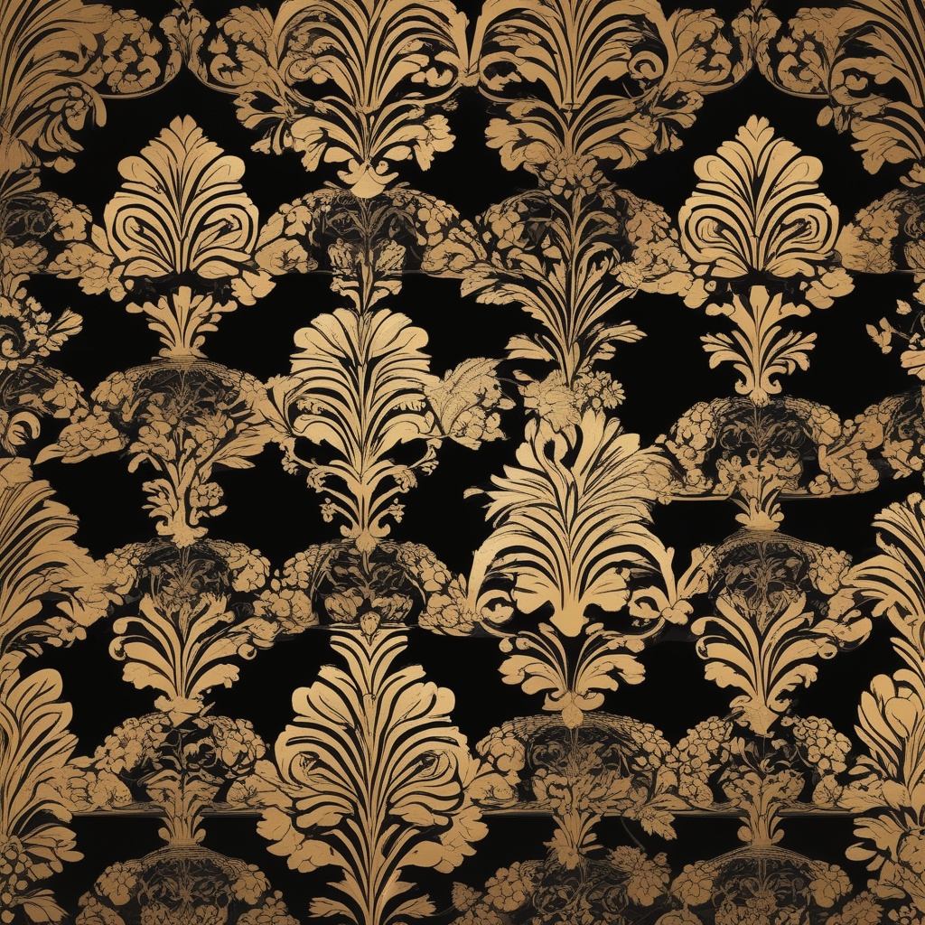
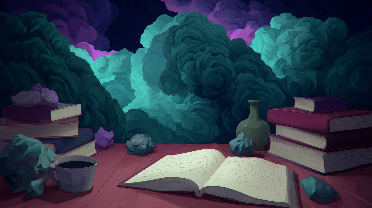
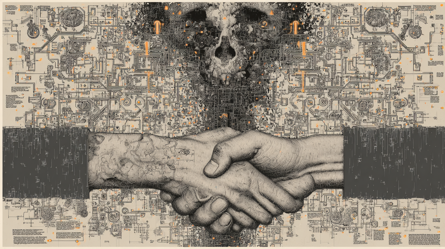
The allure of a two-tone photograph lies in its simplicity and dramatic contrast, turning ordinary scenes into striking visual stories. When an image embraces only two colors, every element-light, shadow, texture-must collaborate to create a cohesive narrative. Photographers worldwide harness this minimalist palette to evoke mood, emphasize form, or highlight cultural themes.
Origins of Two‑Tone Photography
Early black‑and‑white photography was naturally two‑tone, using only black and white to represent the spectrum of grays. However, true two‑tone photography deliberately restricts the color range to just two hues. The technique gained popularity in the late 1990s when graphic designers and social media influencers began experimenting with duotone filters, offering a fresh aesthetic that balanced nostalgia with contemporary flair.
Psychological Impact of Limited Color
Color psychology shows that a restrained palette can amplify emotional response. For instance, pairing a cool blue with a warm orange can evoke calmness alongside optimism. Two‑tone images leverage this by forcing viewers to focus on composition and contrast rather than getting distracted by a full spectrum. Studies from visual perception research suggest that simplified color schemes improve memory retention for visual content.
Choosing Your Color Pair
Successful duotone images often begin with a strategic color selection. Photographers test combinations that either complement or contrast sharply. Complementary pairs, such as teal and gold, generate vibrancy and depth. Contrasting pairs, like charcoal and mustard, deliver bold statements that can dominate a visual hierarchy. The choice usually aligns with the image’s subject: serene landscapes benefit from cool blues, while urban street scenes thrive with saturated reds.
Technical Workflow for Two‑Tone Conversion
Converting a photograph to two tones involves several steps. First, the image is desaturated to a grayscale baseline, preserving luminosity values. Next, the artist applies a color overlay for the dominant hue, mapping the darkest tones to a deeper shade and the lightest to a lighter tint. A second overlay introduces the secondary color, assigned to mid‑tones. Modern editing software provides presets that automate this process, yet seasoned editors adjust curves manually to preserve texture and detail.
Common Mistakes to Avoid
One frequent error is overusing contrast, which can lead to loss of detail. When the two colors clash too sharply, subtle textures may disappear, especially in areas where the tones overlap. Another pitfall is neglecting the tonal range: if one color dominates too much, the image feels lopsided. Successful two‑tone photos strike a balance, ensuring each hue contributes equally to the visual rhythm.
Use Cases in Modern Visual Storytelling
Brands use two‑tone images to create iconic visual identities. Think of logos or advertising campaigns that rely on a single bold color paired with neutral tones. In editorial photography, duotone treatments highlight narrative elements, such as isolating a subject from a cluttered background. Cinematic stills also adopt the style to evoke specific eras, referencing classic film noir aesthetics while maintaining contemporary clarity.
Case Study: Duotone Portraits
A photographer captured a series of portraits where the subjects wore muted clothing against a backdrop of vivid color. By applying a teal overlay to the background and a muted gray to the subjects, the images emphasized facial features while keeping the composition harmonious. Viewers reported that the portraits felt more intimate, as the color reduction drew attention to emotion rather than distraction.
Practical Steps for Beginners
Start with high‑resolution images to preserve detail during color mapping.Experiment with both complementary and contrasting palettes to see which suits your subject.Adjust the opacity of each overlay layer to fine‑tune the balance.Use the histogram to ensure a good spread of tonal values; avoid clipping.Preview the image on various devices to confirm that the two tones remain distinct.
Final Thoughts
Two‑tone style pictures transform ordinary photography into powerful visual statements. By limiting color to two deliberate hues, photographers heighten focus, evoke emotion, and create memorable imagery. Whether used for artistic expression, brand storytelling, or personal projects, mastering the duotone technique opens a world of creative possibilities. Embrace the challenge of working within constraints, and watch as each image gains a striking clarity that resonates across audiences.


No comments yet. Be the first to comment!