


Understanding the Psychology of Color
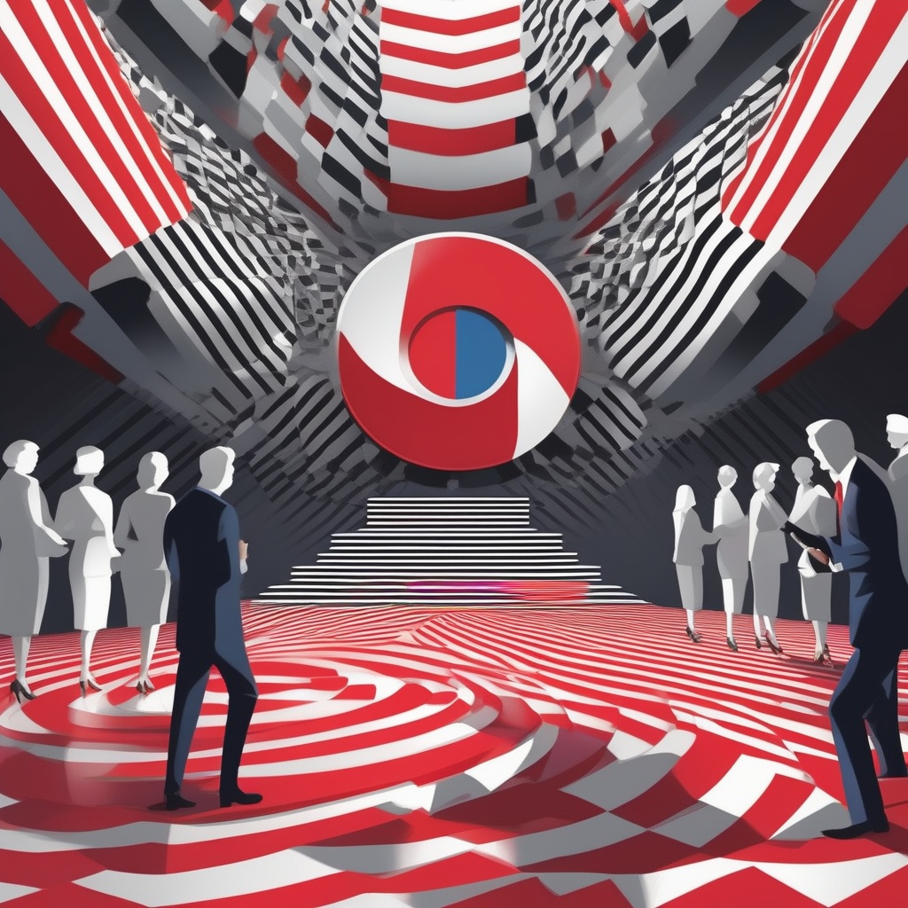
When you look at a webpage, you don’t just see paint and pigment; you see signals that influence the way your brain reacts. The way colors sit on the spectrum tells your eyes and your mind what to expect. The core of color theory comes down to a handful of primary hues - red, green, and blue. Red and blue sit at opposite ends of the visual spectrum, while green lies midway. That split matters because the eye’s anatomy responds differently to each end. Blue wavelengths strike the retina first, creating a sense of distance and calm. Red wavelengths reach deeper, pulling attention and stimulating the body’s fight‑or‑flight response. These biological differences translate into emotional cues: blue evokes stability, trust, and logic; red sparks excitement, urgency, and passion.
Researchers have shown this effect in real‑world experiments. In one study, a heavy weightlifter faced a massive 200‑ to 250‑pound barbell. When a large red card filled his field of vision, he lifted with effortless ease, his body showing no signs of strain. Swap the card for blue, and the same athlete could barely clear his own torso. The change was immediate - no physiological fatigue, only a shift in mental load. A similar setup with newborns in a hospital revealed that red light amplified their crying, while blue light settled the room almost instantly. These controlled trials illustrate that color can act as a psychological lever, tipping the scales between energy and calm, effort and ease.
While the science is compelling, the takeaway is practical: the colors you choose are not mere decorations; they are part of your brand’s story. A site filled with soft blues signals safety and reliability - ideal for financial advisors, law firms, or medical practices. Conversely, bold reds shout urgency and are perfect for clearance sales, sports teams, or adrenaline‑driven products. Knowing these associations lets you design with intent rather than chance.
Another layer to consider is cultural nuance. In Western contexts, blue is often linked to professionalism, whereas in some Eastern cultures, red carries that same trust signal. Always pair color choices with your target demographic’s expectations. And remember: color perception is highly personal - what feels calming to one visitor may feel cold or detached to another. That’s why the most effective palettes find a balance that speaks to the majority while still resonating on an emotional level.
Beyond hue, saturation and brightness also influence mood. A deep navy can feel weighty and authoritative, while a lighter sky blue feels airy and approachable. High saturation draws the eye and can drive action, but overuse can overwhelm. Low saturation calms and offers a subtle backdrop for content. These subtle shifts let you tailor a site’s visual rhythm, guiding visitors through information and call‑to‑action with a steady, deliberate beat.
Color also interacts with other design elements. Text contrast matters for readability and accessibility; a bright orange button on a dark navy background pops without being jarring. Shadows, gradients, and textures can give a flat palette depth, making a minimalist scheme feel richer. All these factors compound, turning color from a single visual cue into a holistic language that speaks directly to the human psyche.
In sum, color is a powerful, almost subliminal tool that can shape a visitor’s feelings before they even read a word. Understanding the science behind how blue calms and how red excites gives you a roadmap for building brand experiences that move people - whether you’re looking to inspire trust or ignite action.
Choosing Colors That Match Your Brand Goals
The first step in harnessing color is aligning it with what you want to communicate. Start with the core emotions you wish to evoke. If your business centers on safety, reliability, or tranquility - think insurance, healthcare, or legal services - blue is your ally. Blue’s low‑energy, high‑trust signal keeps users calm and encourages them to engage with detailed information. A palette that leans toward light blues, teal, and muted grays conveys a sense of steadiness while keeping the interface welcoming.
When excitement, urgency, or boldness are your priorities - such as with sports apparel, technology launches, or limited‑time offers - red takes the stage. Red’s high‑energy, high‑visibility traits push users toward action. Pair it with complementary neutrals like white or charcoal to keep the overall look balanced. A single splash of red on a blue background can also act as a powerful trigger for conversions, drawing the eye to key buttons or promotional banners.
Often brands need both sides of the spectrum. A financial firm might use navy for its corporate sections and a bright green for investment growth, combining the trust of blue with the optimism of green. In contrast, a cosmetics brand might lean on soft pinks and purples to evoke sensuality, while still integrating cool blues for trust and professionalism. The key is intentional contrast: use one color for the primary message and a secondary color to accentuate call‑to‑action elements.
Think of how the colors speak to your target demographic. Younger audiences often prefer vibrant, saturated hues that feel modern and dynamic. Older demographics may respond better to subdued, classic tones that suggest heritage and stability. A tech startup targeting millennials might combine electric blues with neon accents, whereas a boutique legal practice aimed at retirees could favor deep, rich blues with gold highlights.
Accessibility is another layer. Colorblind users may misinterpret certain hues. Use tools like WebAIM’s color contrast checker to ensure text remains legible over background colors. Aim for a contrast ratio of at least 4.5:1 for body text and 3:1 for large text. Red and green combinations can be problematic; if you use both, keep them separate or add patterns to differentiate. These small adjustments make your site welcoming to everyone while preserving the emotional power of your chosen palette.
Test your color choices in the context of the full user journey. A landing page may start with a bold header in your signature blue, inviting users to explore. Subsequent sections can introduce a warm accent - perhaps a subtle orange - to highlight testimonials. Throughout, keep navigation consistent with the core brand color, ensuring visitors feel anchored no matter where they are on the site.
Remember that colors evolve with trends. While the timeless appeal of navy remains strong, pastel blues and mint greens are gaining popularity for their calming, eco‑friendly vibe. Red, too, can shift from a classic aggressive hue to a deeper burgundy for a more sophisticated feel. Stay agile: revisit your palette annually, checking against analytics to see how color changes affect engagement metrics.
Ultimately, color selection should feel like a strategic conversation between your brand’s mission and the emotional palette that best expresses it. With careful mapping of hue to goal, you lay a solid foundation for a site that not only looks good but also feels right to every visitor.
Putting Color into Action on Your Website
Once you’ve mapped your color intentions, translate them into a coherent visual system. Start with a primary palette that defines the brand’s identity - typically one dominant hue plus two supporting shades. For example, a professional law firm might choose deep navy, soft slate, and crisp white. These colors will dominate the header, footer, and main navigation, creating a stable visual anchor.
Next, develop a secondary palette for calls to action, highlights, and subtle accents. In the law firm scenario, a muted gold could serve as a button color, offering contrast without overwhelming. Ensure that every interactive element stands out against its background; high contrast not only boosts usability but also signals intent. A bright button on a navy background invites clicks, while a faded button can suggest inactivity.
Use a consistent color hierarchy across all pages. Assign each color a clear role: primary brand color for branding, secondary color for actions, tertiary color for informational text or background accents. When the same hues appear across a site, visitors develop expectations - this psychological consistency builds trust.
Implement color strategically in microinteractions. Hover states can shift a button’s hue slightly, signaling responsiveness. Form validation messages often use red to indicate errors, while green confirms success. Keep these cues subtle; a full‑saturation red can feel jarring if overused. Instead, pair the alert color with neutral backgrounds to maintain readability.
Accessibility testing should be part of your launch checklist. Use contrast ratio tools to confirm that all text meets WCAG AA guidelines. For color‑blind users, add text labels or icons to buttons - this ensures that color alone doesn’t become the sole means of conveying information.
Consider the emotional journey of the visitor. A cosmetic surgeon’s site - like the one at drdubois.com - might employ soft pinks and purples to create an inviting, hopeful atmosphere. These hues suggest beauty and transformation, encouraging potential clients to explore services. In contrast, a medical practice for general practitioners might lean on soothing blues to reassure patients of expertise and calm.
For e‑commerce, test the impact of color on conversion rates. A/B testing different button colors on a product page can reveal whether a fiery orange or a serene teal drives more purchases. Track metrics such as click‑through rate, add‑to‑cart percentage, and average order value. Use these insights to refine the palette iteratively.
Finally, integrate color into your brand’s broader communication. Align website hues with packaging, social media, print collateral, and email templates. Consistency across touchpoints strengthens brand recall and builds a cohesive identity that resonates with customers.
By following these steps - defining a purpose‑driven palette, assigning clear roles, testing for accessibility, and ensuring cross‑channel harmony - you transform color from a decorative choice into a strategic marketing engine that guides visitors toward meaningful action.


No comments yet. Be the first to comment!